Staying Creative with Rosie Flaherty
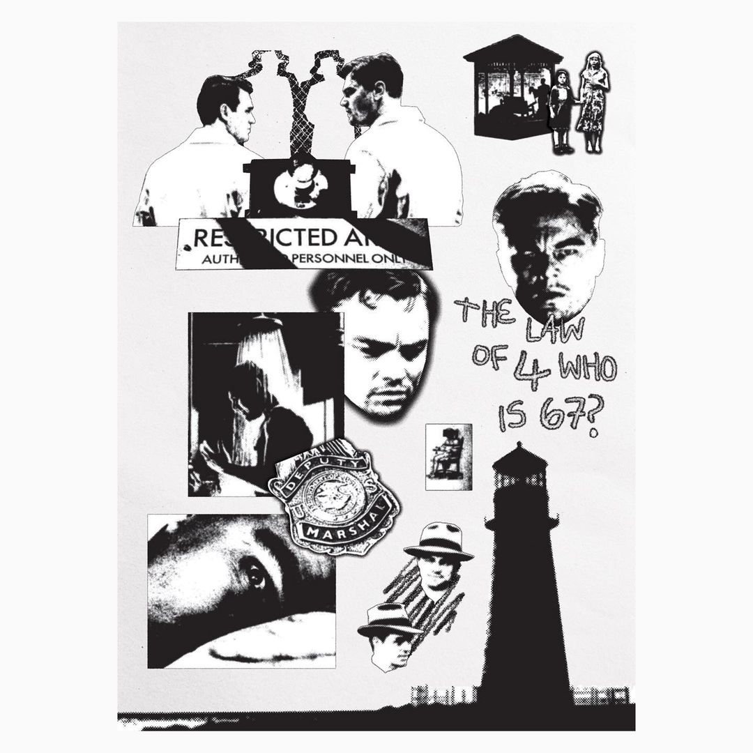
This week we chat to 2021 Art Comp Winner Rosie Flaherty about her Art Comp submission and how Pop Culture influences her work. Check out the full interview below.
To see more of Rosie's work, make sure to follow her on IG here.
Thanks again for entering the Art Comp! How did you get into image making?
No problem! I'm currently a second-year graphic design student at the University of Brighton and I've been studying design for just over three years and before that, I took fine art at school. I'd always considered art to be my strong suit and it was something that I spent a lot of my free time doing (which is still true today). I found that the fine art course wasn't quite right for me and when it came to picking A-Levels, graphic design seemed like a good transition away from the strictness of other arts courses. I'm still just a baby in the professional world of design but I am excited to continue creating.
Where does your inspiration come from?
A lot of my inspiration comes from my friends and other members of my design course, it's great to have that network of other designers. Film and music have always been very influential to my work, I find it a very fun process to create based on media like that.
Any favourite themes or points of exploration in your work?
I love to create design materials by hand and then manipulate them digitally. In doing this, you can capture textures and layering that would be hard to replicate using software. As well as this I find screen printing a fascinating process - the amount of detail that can be produced through screen printing is incredible. Typography, layout and animation are areas that I've begun to explore more recently. Uni really opens your eyes to all areas of design!

Can you tell us about your submission to this year's Art Comp?
I've been following SCRT for the best part of two years now, I was very excited to enter the comp this year. Much like SCRT, a large portion of my design style reflects upon pop-culture, cult classics and unconventional presentation. I wanted to submit something that I personally would be excited about if I saw it on your site. Donnie Darko (the focal point fof the work) is such a bizarre movie, I really enjoy movies that are just a bit random, they're captivating and a reminder that cinema doesn't always have to be easy to consume. I wanted to pay homage to that and to design something visually a bit weird and would appeal to fans of bold, unconventional design.
Any favourite piece of yours?
Anything I've created in the past year, my work ethic has really improved since the first lockdown. It was very tough to create when things first shut down but I've picked myself back up and because of that I'm proud of everything I make.

Any new styles or mediums you've been trying?
I'm trying to experiment more with animation, kinetic type and software like after effects and cinema 4D because it's so prominent in the design world right now. Anyone who knows how to use after effects effectively is my hero.
What advice would you give for an upcoming creative in your field?
Get your work out there. Never underestimate how useful social media can be as a source for growing your network. Almost all the design work I've gotten has been because clients have found my instagram page and liked what they saw. Also, don't be afraid to reach out to people you'd like to work with or to other designers you admire. Most people are more than happy to give advice or recommend tutorials etc me included!
Favourite film?
The Shining (1980). A masterpiece in every way.
Dream Client/Collab?
Sort of random but I'd love to design for the band COIN. I'm super into their newest promotional material and their music has been a favourite of mine for a while.
Lastly, any designers you want to shoutout?
Instagram is such a great resource and source of inspiration, some of my favourite designers I've discovered are - @jonathanpaigedesign @
Cheers Rosie!


